A2 DEADLINES
A2 DEADLINES
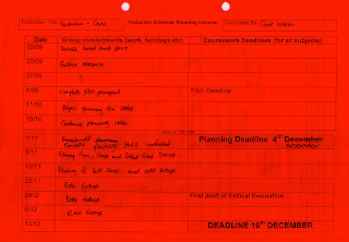
Research and Planning/Hand in Folder: November 4th
Finished Music Video: December 16th
Finished Website/CD Cover/Evaluation/Blog:13th January
Monday, 24 January 2011
Wednesday, 12 January 2011
Evaluation
We have used quick cuts and different effects on the movie such as transitions, which are used in a lot of drum and bass music video’s. We also used a theme of conflict, as there is usually something conflicting and quite often there is a running sequence. These are some of the conventions we decided to incorporate. However we decided not to use the blue effect throughout the video, which you see in a lot of pendulums video’s like 'The other side', although we used it in the performance side along with fog and flash. We used a twist at the end with the game of checkers as it wouldn’t have been expected in the style, although in a video by chase & status, another drum and bass group started their narrative with a game of poker so playing a game in its self is not completely new although it is still a change on the ordinary conventions of drum and bass. Also the theme of running is quite conventional in the genre as many different artists use this theme. To maintain a clear image we used a similar style across the video, website and CD cover, which included the use of the colour blue, an urban image and the feeling of conflict. This image represents our target audience of young males that would be appealed by our consistent style.
The conventions have allowed us to create a structure throughout the video as there is often a conflict and a running sequence so we were able to convert these things into the narrative, also the performance is able to stand out as the effects that the genre uses. And due to the quick shots and action in the genre it enabled us to get both the storyline and the performance across as you are able to get clips in time to the rapid movement so the speed of the song effects the speed of the clips which enabled us to plan the video accordingly. Throughout the project we were focused on the effects and the blue lighting from the genre and as well as getting this across in the performance section we incorporated it on to our CD cover and website. The genre is good when it comes to relating the different types of media as it the bright effects can transfer from one piece to another linking them all in and making them relevant, also for the inside sleeve of the CD cover we decided to change the style slightly and relate it to the narrative, rather than the effects that we used in the performance, and we used a picture of the characters in the set up of the movie and then added a different style of blue to it just to make it seem like it is all one product.
The website, the performance in the video and the CD cover all use similar effects such as the bright blue, negative effect. The inside sleeve of the CD cover relates to the narrative of the video as we used an image from the video on it, which will help link them together. We then added effects to the image to change the style. Then the performance and the narrative both fuse together in the video linking all of the different products together in a way that doesn’t seem repetitive as they have a change to see all the different sides of the genre.
The products all target the same audience as they are all related and by the use of our narrative and a performance in the video, which will attract the 18-25 year old male market we are targeting. The audience can also relate to what they have already seen in the genre and if they don’t know the genre they can still relate as the narrative aspect also carries them along and could possibly make them listen to more songs in the genre and by the artist.
We gathered a range of feedback from teachers and students on all of our products and found it all useful and it enabled us to improve our production. One of the issues raised was lip synching which at the time was slightly out and we have corrected the issue, another big problem raised was in the beginning scene of the video we had to re-film as the footage was quite dark and we were told that it may be a problem so we reshot it and it has enhanced the film.
Possible problems with audience feedback is that the person feeding back is not the type of person that your product is aimed at as they have a different taste in music, which means that they are less interested in the product and the feedback may not be as effective. Also they may not see the reasons for certain shots and effects as they don’t know the conventions of the genre.
Before planning our music video we researched into drum and bass and found out what the conventions consisted of using internet websites such as Wikipedia, myspace and other band websites. In the creation of our products we used iMovie to create the film, which enabled us to edit the footage we filmed through the use of cuts effectively as well as the use of a few different transitions and effects to enhance the product. Having used this software previously in our AS year we were able to take these things into account while planning the production so we had a clear image in our minds about what needed doing. Also the Internet played a big part as we were able to have a look at music videos on youtube to give us an idea of the conventions and how to use different effects. This also gave us an inspirational drive to make our video using ideas of previous artist’s videos. It also gave us ideas about how to create our CD covers and websites by viewing previous artists work. In the design of the CD cover and the website Photoshop was the main software we used to create the images and we then where able to copy the website that we designed onto iWeb which allowed us to turn it into a website. When on iWeb we could place the finished video on it.
Research and Planning


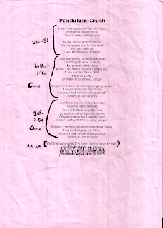
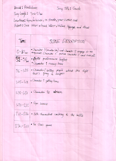
This is the paperwork from our planning folder for the music video. In this folder we researched the conventions for our genre and incorporated them into our planning. Some of the information we planned was not eventually used because of better ideas or problems that we occurred and needed to change. For example for the storyboard we drew character 2 texting people about the future 'fight', however because our camera did not pick up the text of the phone when filming we decided to make it a phone call.
Chris Wilson & Danny Rankin
CD cover and inside sleeve
This is the Completed CD cover, back and inside sleeves. We decided to relate the inside sleeve to the video as it would link the product to the video and the front and back covers are styled on the genre and the effects that it requires.
Danny Rankin and Chris Wilson
Completed Website
This is the completed website with our music video attached. It has links to popular sites attached such as Facebook, Twitter and Myspace, also it contains merchandise and tour dates.
Danny Rankin and Chris Wilson
Website Nearly Finished
This is the website moved onto iweb it is virtually finished we just need to add the music video into the blank square next to the image. We have imported the logos of facebook, myspace and twitter as sponsors.
Danny Rankin
Danny Rankin
Website Nearly Finished
This is the updated website with a few changes still required. The site includes tour dates, merchandise, an image of the artist and news about the artists new album.
Chris Wilson
Chris Wilson
Subscribe to:
Comments (Atom)


